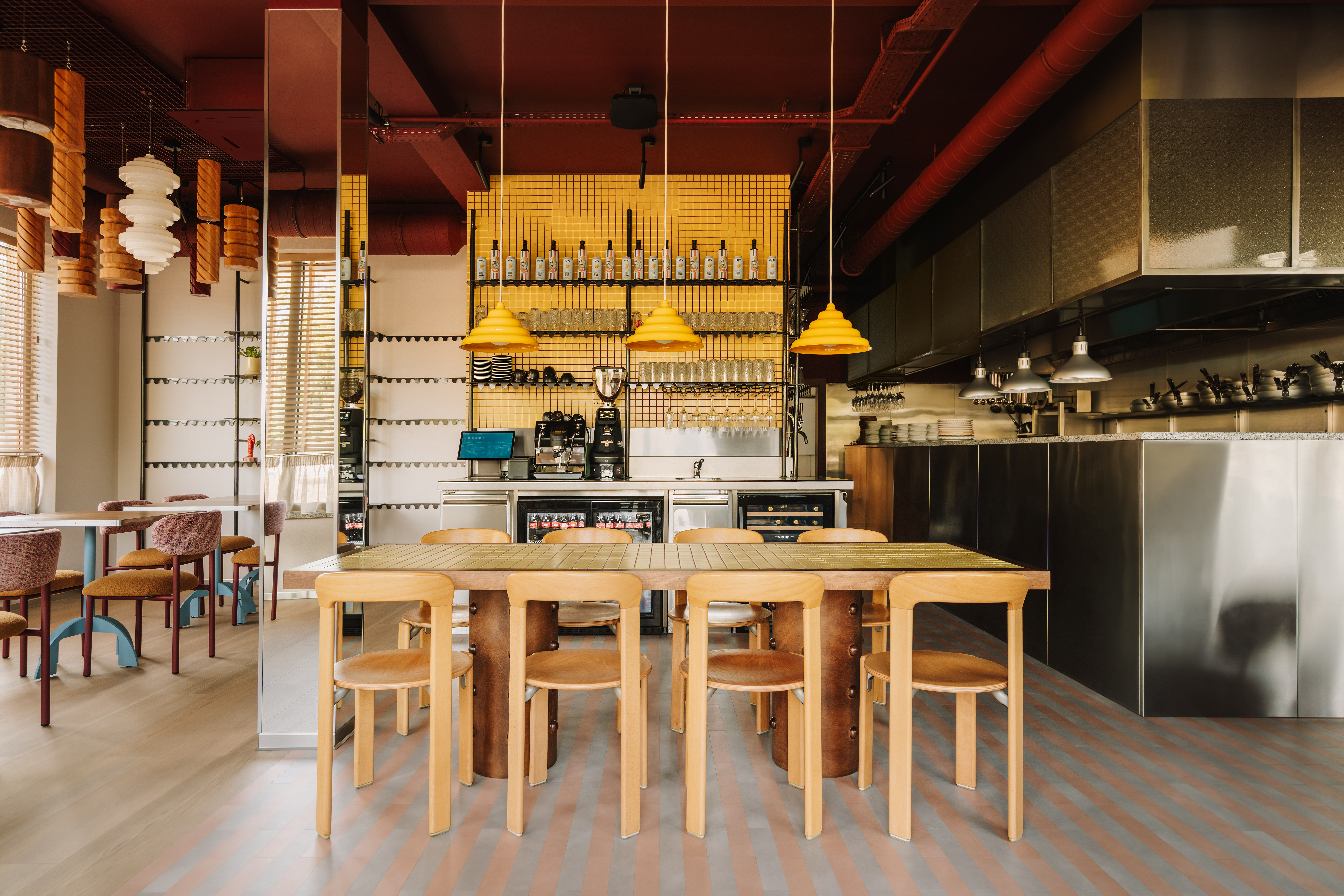
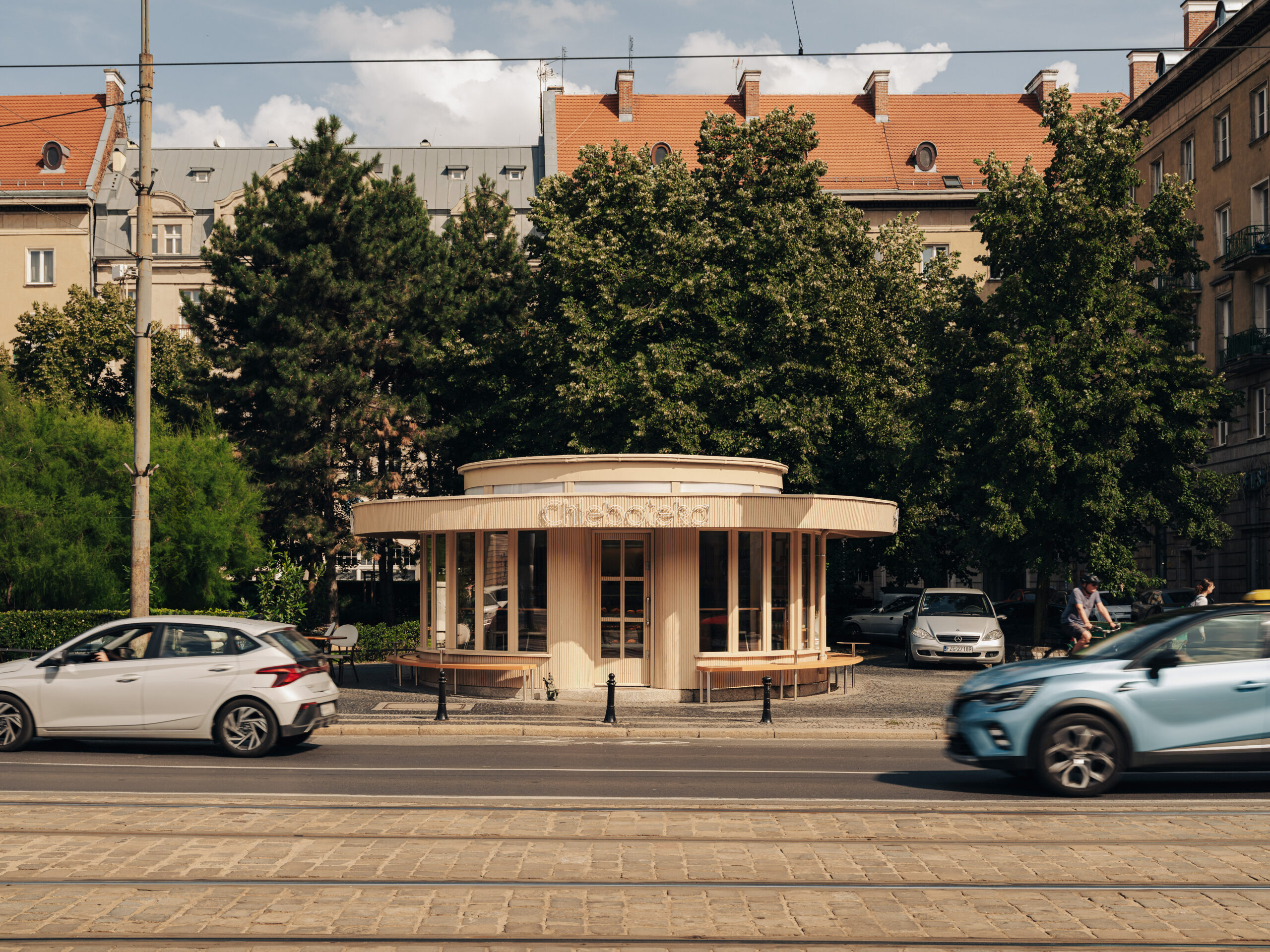
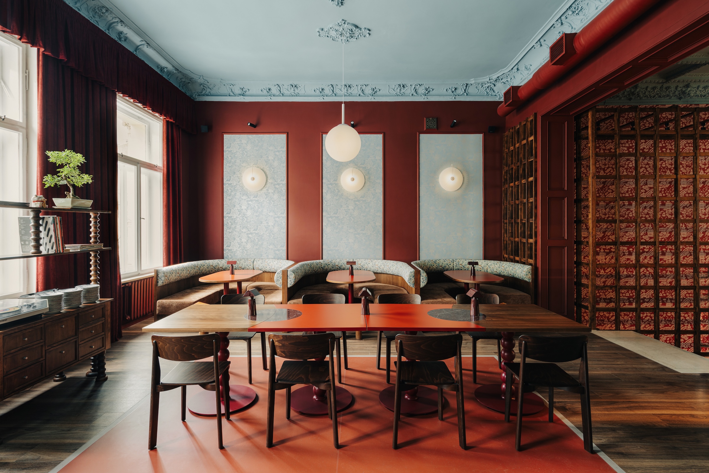
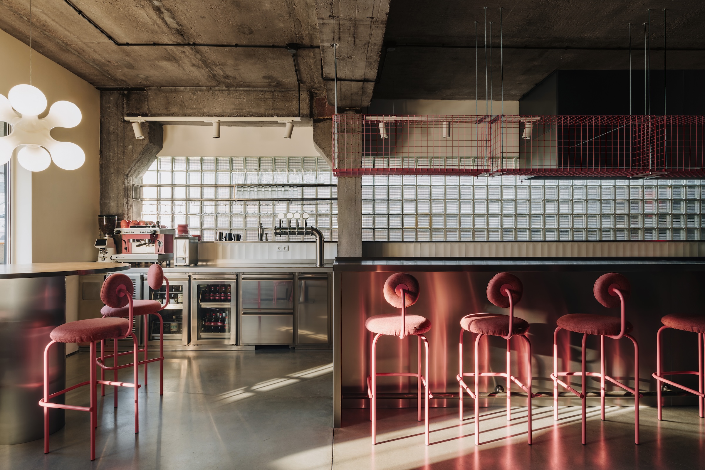
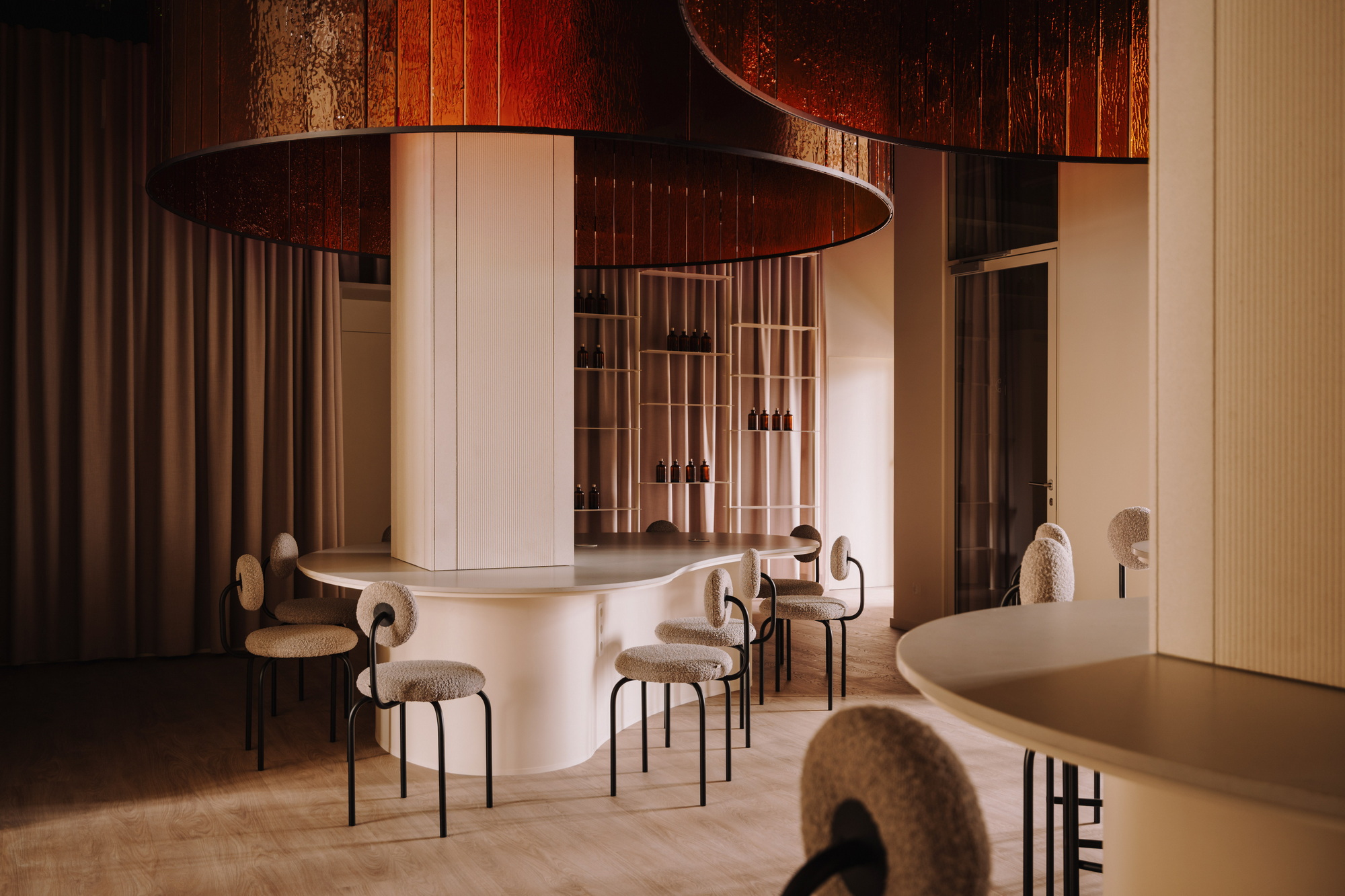
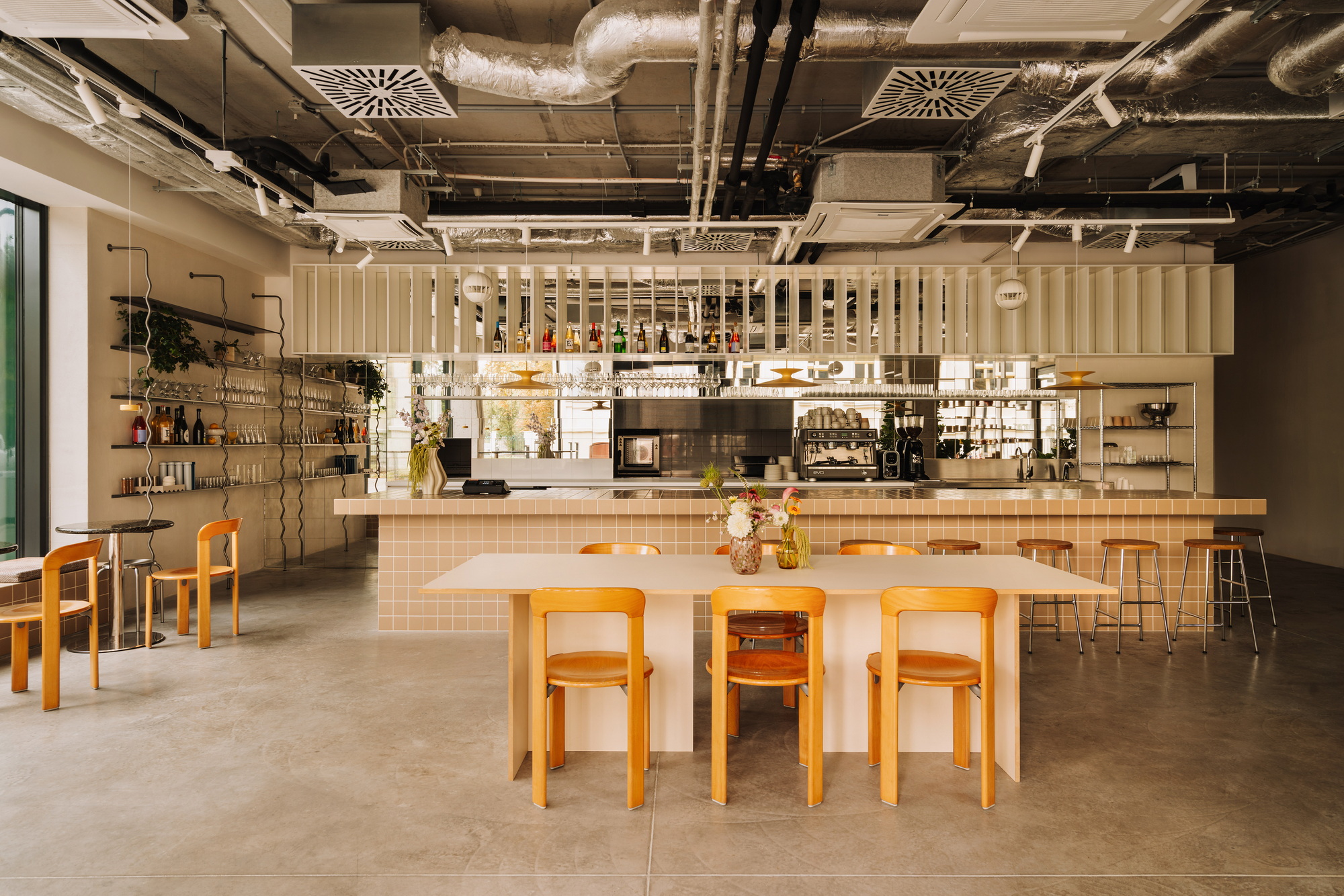
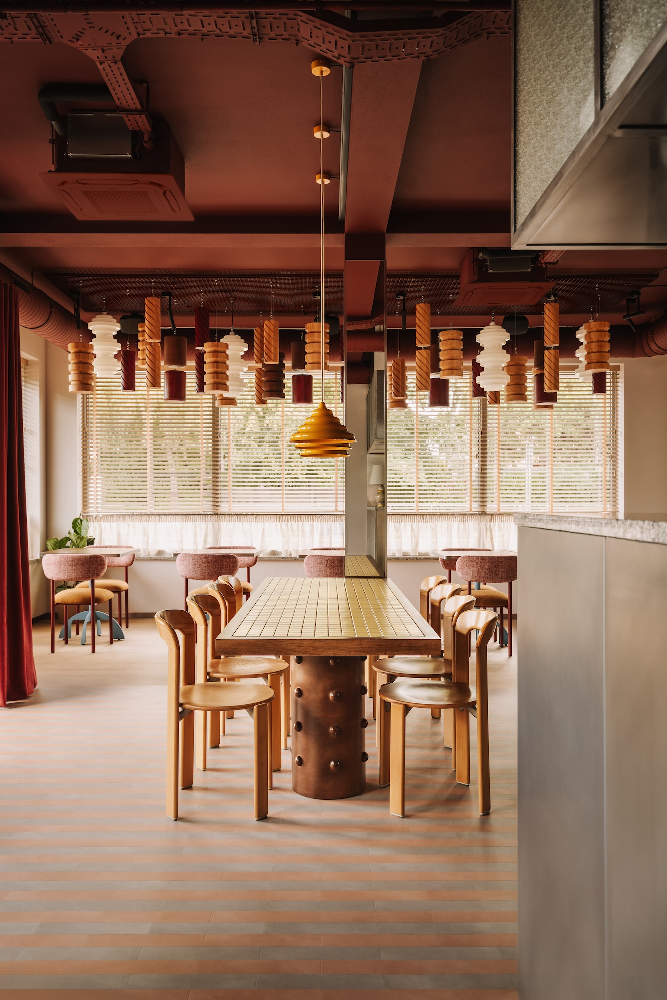
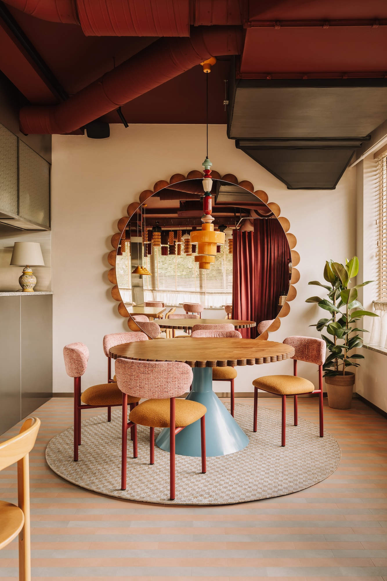
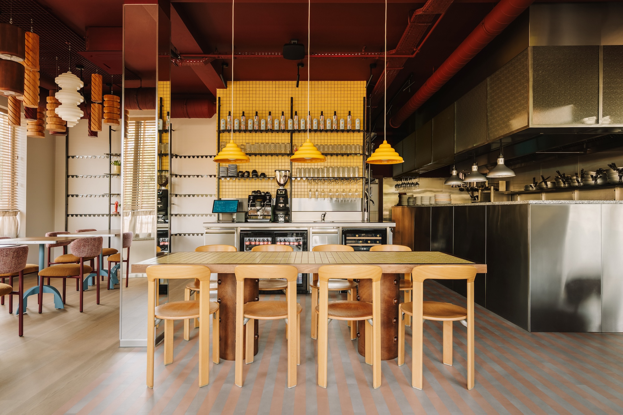
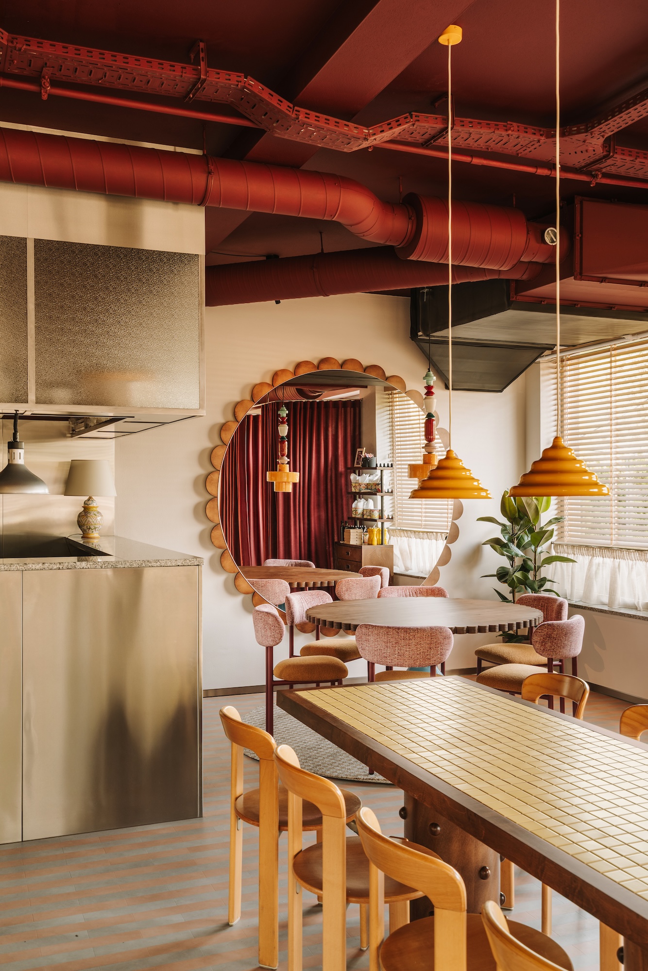
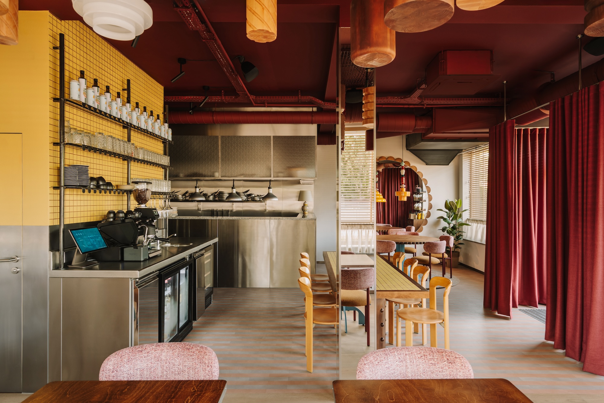
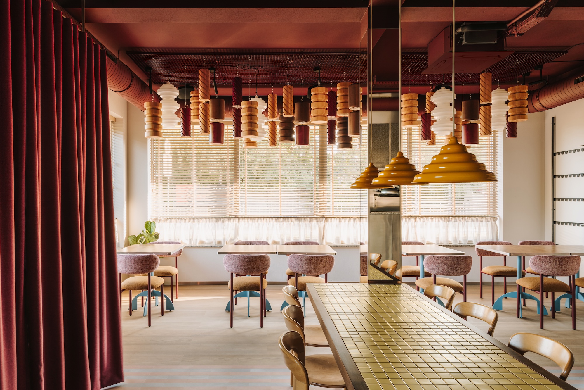
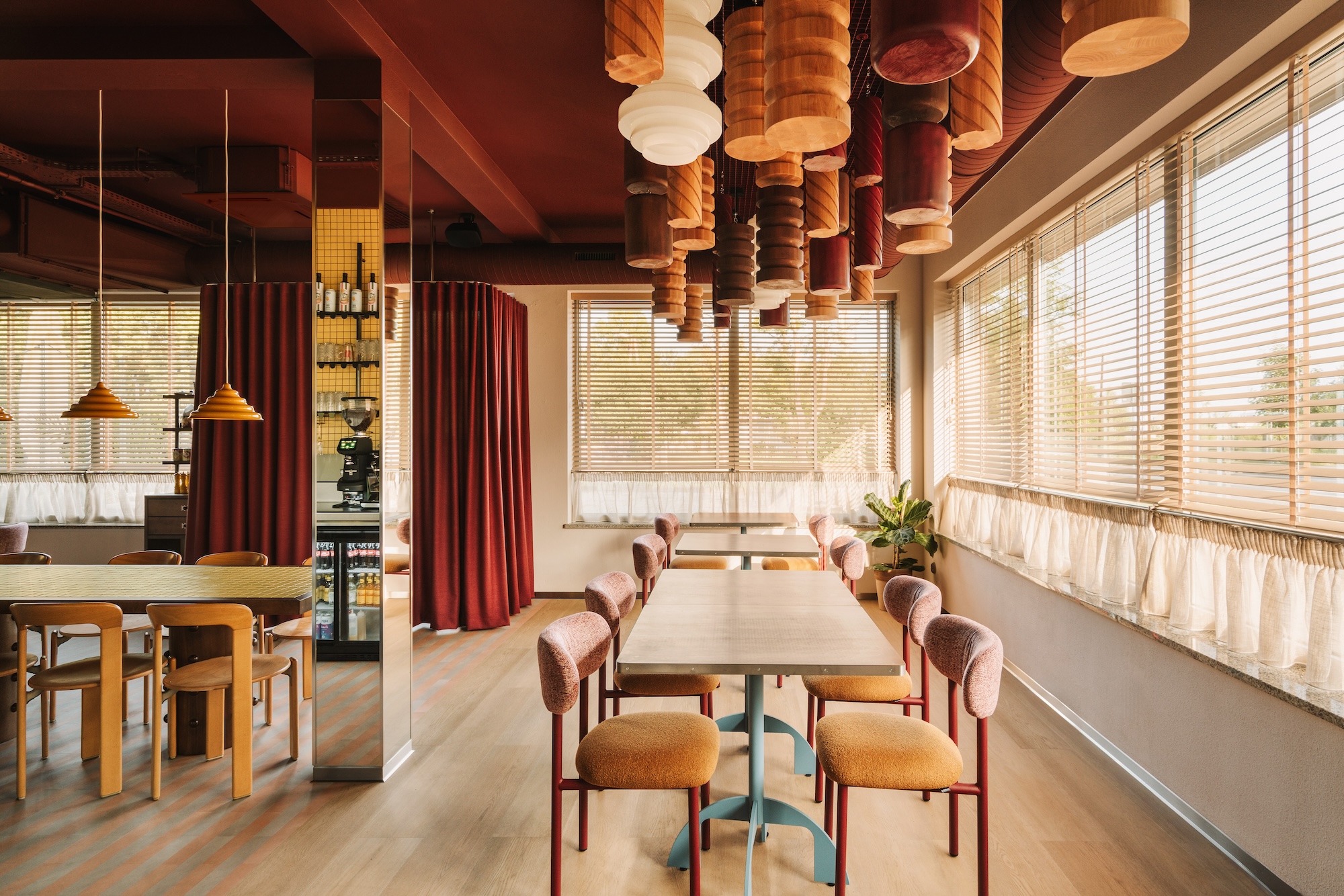
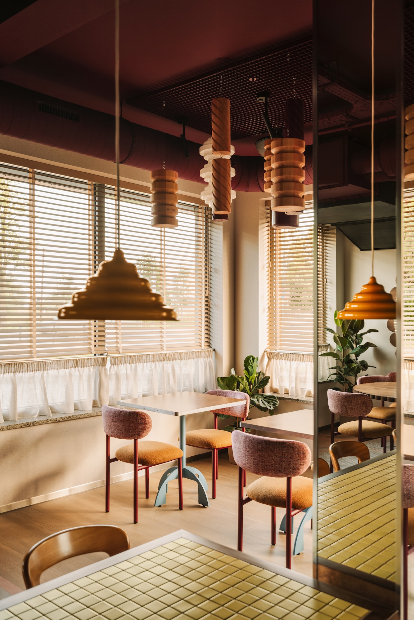
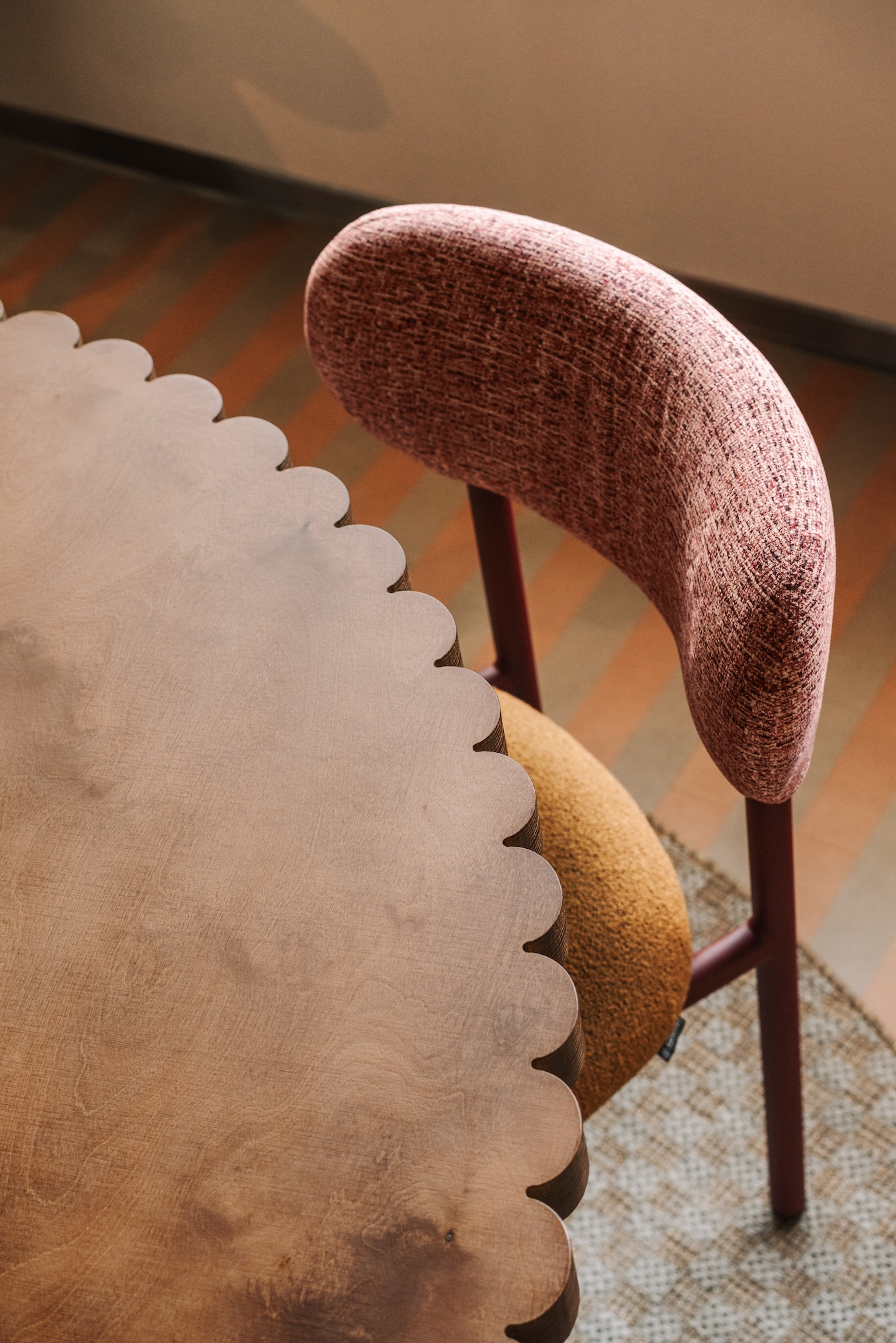
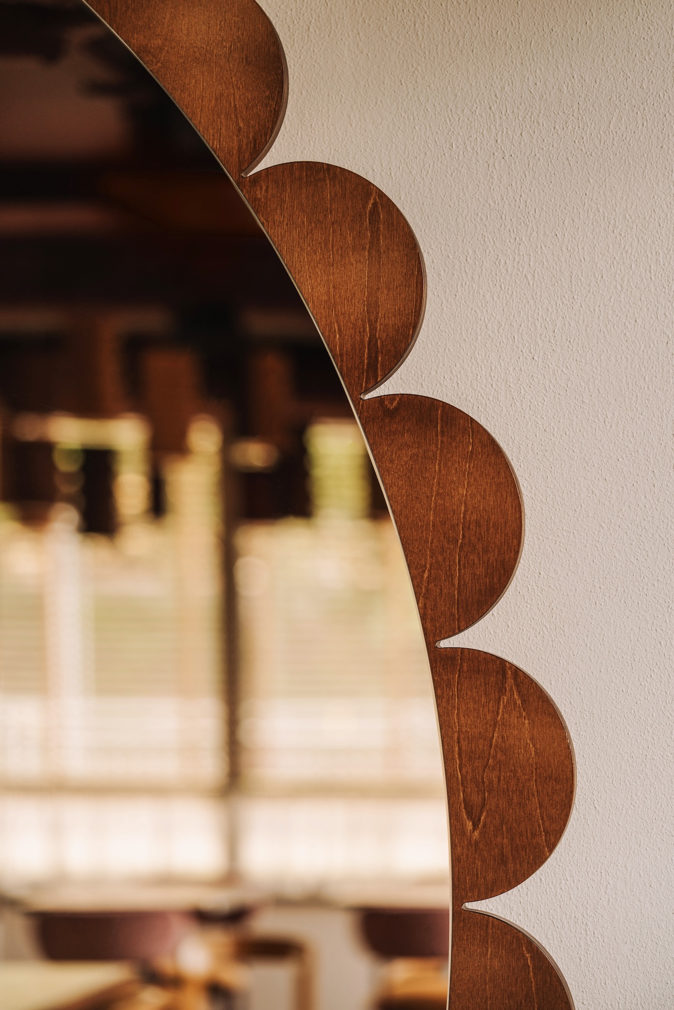
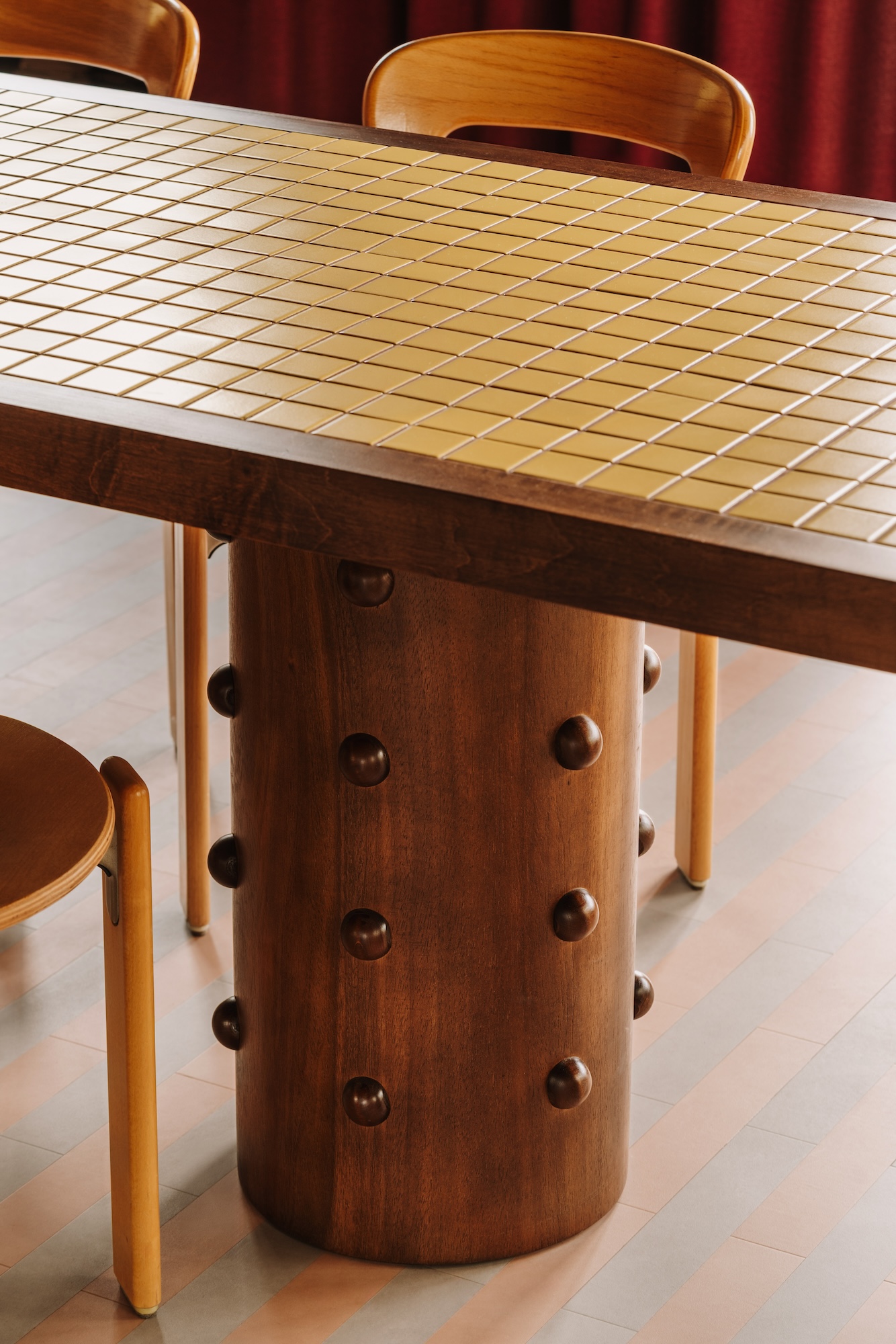
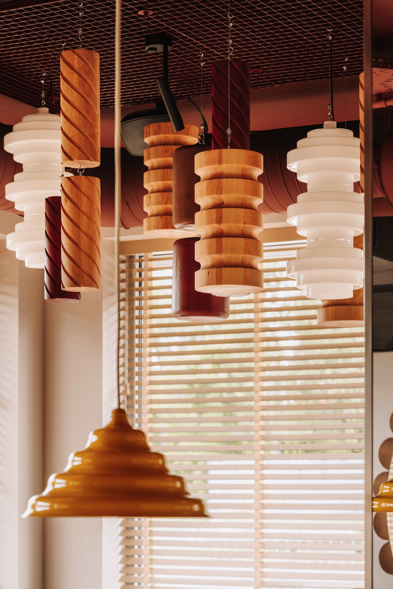
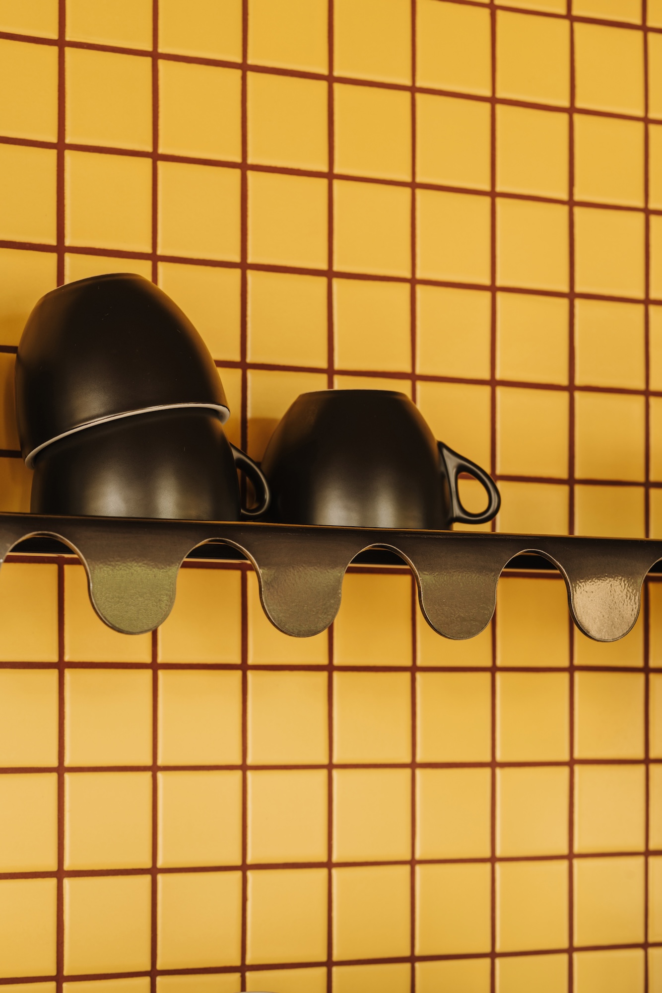
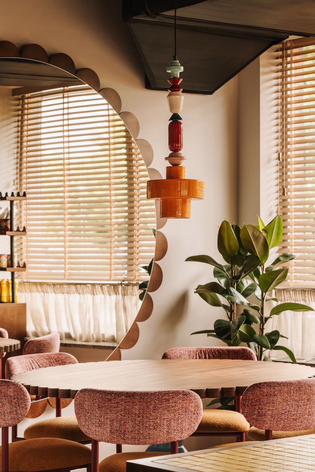
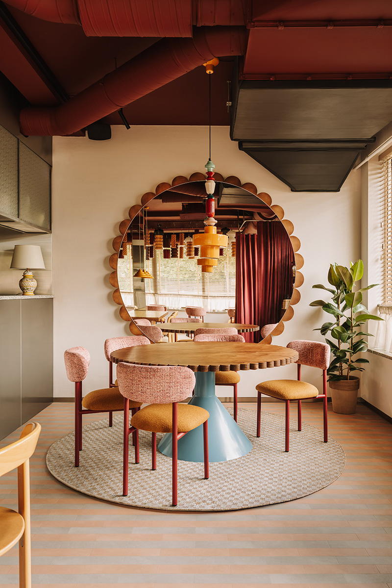
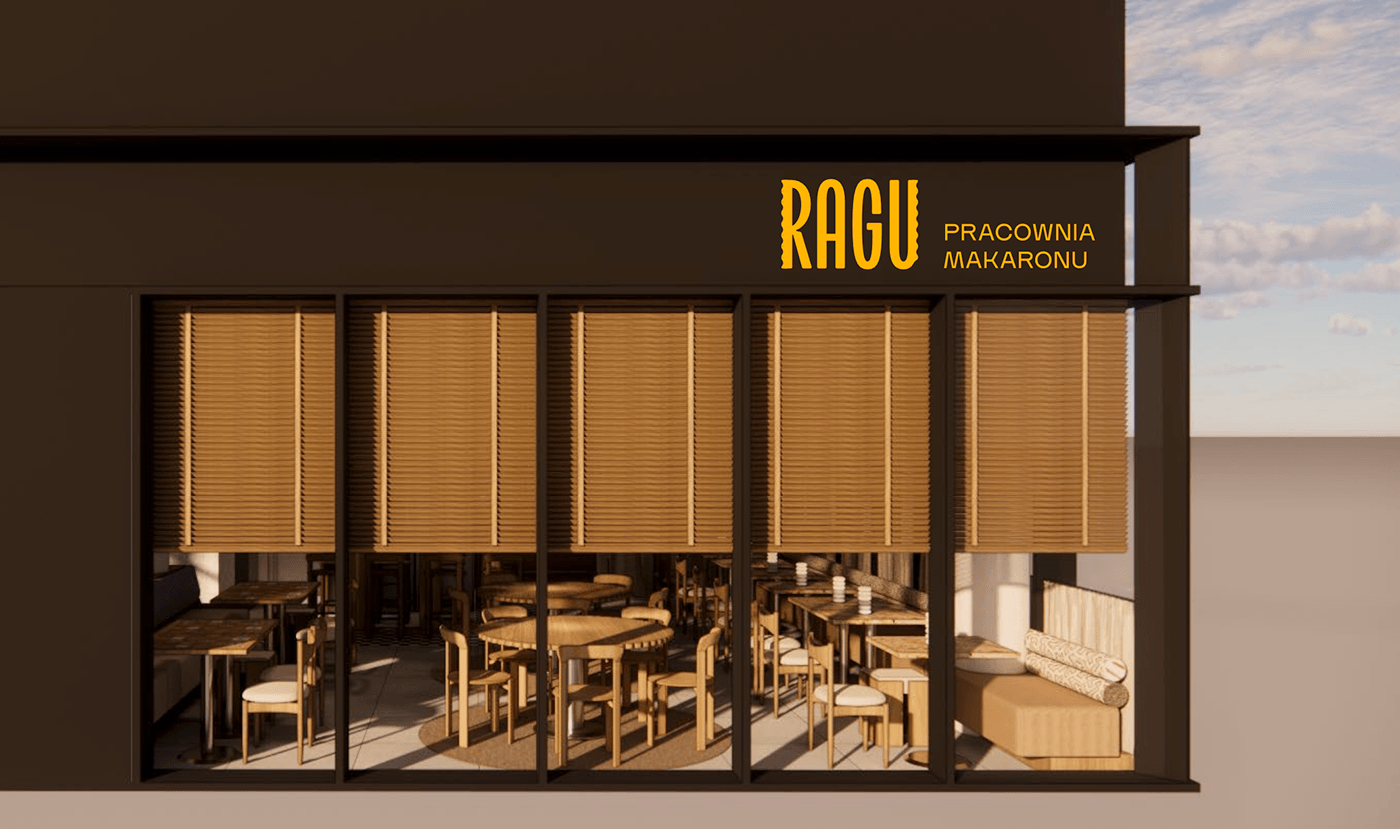
The design for the Ragu restaurant on Borowska Street in Wrocław was created as part of the brand’s expanding chain of locations. In designing subsequent Ragu locations, we developed a cohesive interior design language based on the brand’s signature elements: the color yellow, an open kitchen, Italian-inspired casualness, and distinctive details. As a result, the concept can be scaled and adapted to different floor areas and locations without losing the brand’s recognizable DNA. This is particularly important during the brand’s development phase. CUDO is working with Ragu simultaneously on new locations and changes to the brand identity, allowing the architecture, branding, and operational model of the concept to evolve as a single, cohesive system.
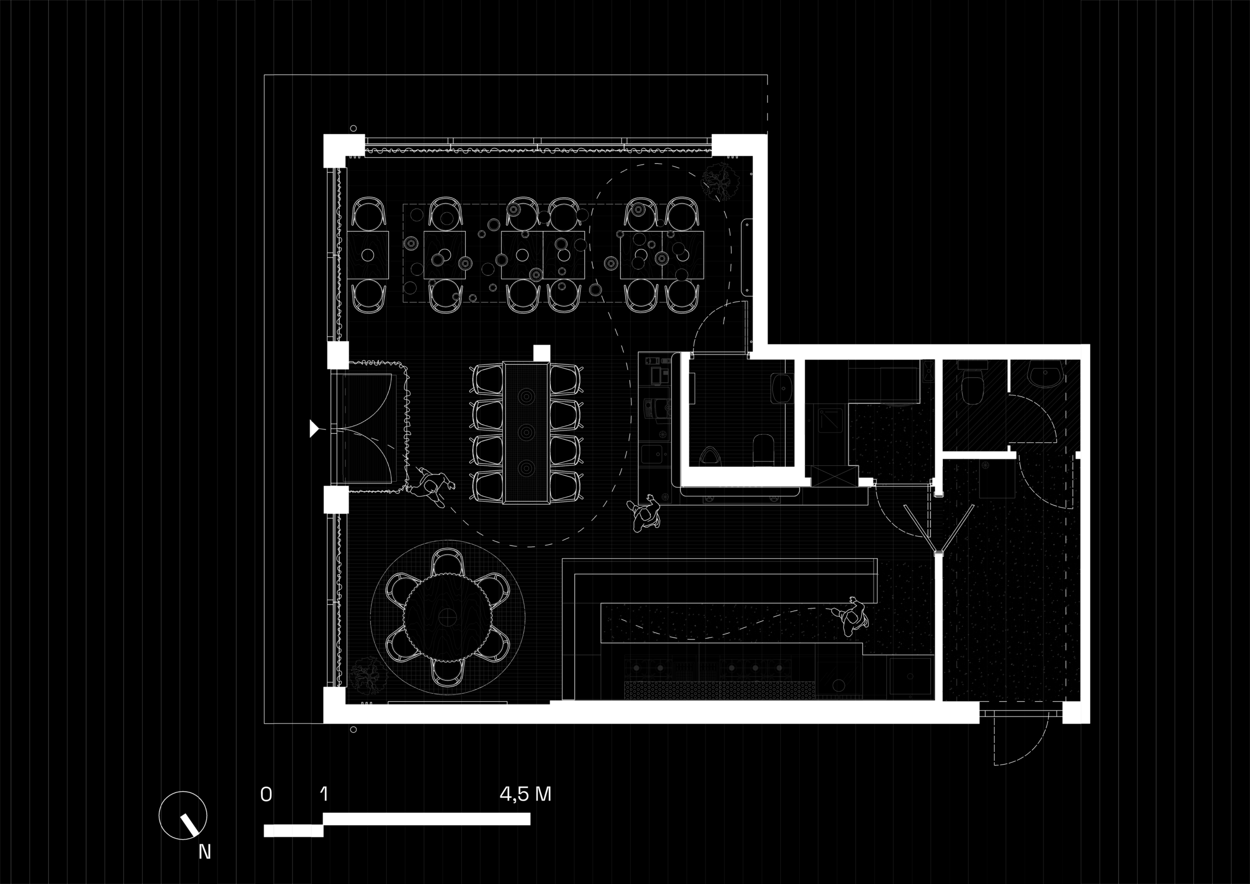
The Borowska location is just 90 m², so the functional layout had to make the most efficient use of the space. Two large communal tables are complemented by two-person tables that can be joined together as needed. The open kitchen and bar form a single, clearly defined core of the restaurant, while also allowing guests to observe the food preparation process. This design not only meets the guests’ needs but also aligns with the restaurant’s operational model. Given the limited space, it was essential to integrate state-of-the-art culinary technology, a comfortable guest area, and the brand’s distinctive experience.